
I wrote the original article Color Theory For Costuming years ago. I heard from many of my students and several clients that they felt as if they were getting stuck in costuming ‘ruts’, choosing the same color combinations and pairings year after year. It’s one thing when you simply adore a specific color palette and enjoy using it often. It’s another thing altogether when you find yourself feeling bored and uninspired by your costuming colors.
Another issue that seemed to come up with dancers I consulted with was a difficulty in adding in interesting accessory and accent colors to their look or problems creating a cohesive, and yet dynamic, look for a group of performers. Some felt their choices were too bland and predictable, whereas, others noticed their combinations seemed chaotic and distracting.
Having a worked in the visual and movement arts most of my adult life, I instinctively knew how to guide dancers to new color combinations that complemented pieces already in their wardrobe, thus helping keep costs down and creativity up. I started offering costume consultations to my clients, students and local dance companies, guiding them on how to build individual or troupe looks and this article grew out of that.
I hope you enjoy this guide!
~Jennifer
Color Theory and You
Whether you are looking for a new color combination for yourself or a set of colors that work well together for a group of dancers on one stage, having a basic understanding of color theory can help.
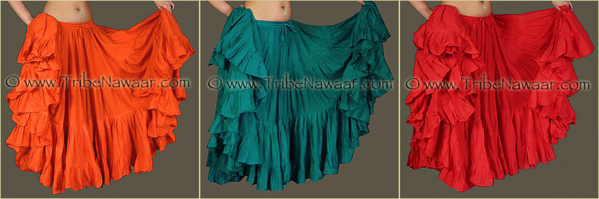
Warm Colors
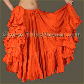
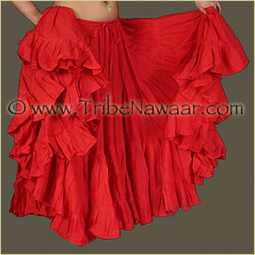
Yellow, Orange and Red family of colors, convey a feeling of warmth, associated with fire & the sun. Often viewed as powerful or energizing, these hues tend to feel as if they are moving forward toward the viewer and create a sense of closeness.

Cool Colors
Green, Blue and Violet family of colors, conveys a feeling of coolness, associated with the sea, sky & plants. Often viewed as soothing or calming, these hues tend to feel as if they are moving away from the viewer and create a sense of distance.

Color Symbolism
Color Symbolism refers to the conscious or subconscious association of a color with a state of being or a type of person, place or thing.
For example, White can symbolizes purity or cleanliness. Red can symbolize power or blood:
Symbolism can vary by region, country or religion. For example, to a Westerner, wearing all white conjures up images of a bride or wedding, while to many in the Far East it is a color symbolizing mourning.
Of interesting note here, the color white has the same basic meaning in both places, purity. While the Westerner uses the purity of white for a bride, those in the Far East would have the same meaning for the color white, but, instead associate it to the purity of the recently departed soul. Therefore, in the Far East, you would often see red as a color choice for the bride, due to the color red’s association there with good luck.
Another example would be the color green and its association to nature in the west (the Green Party, the Green Movement, Green Buildings & Construction), while in places, such as Lebanon, Pakistan and Saudi Arabia, it is viewed as a patriotic color due to its association with the national flag (much in the same way as the colors red, white and blue are identified in the U.S., U. K., France, Thailand & Paraguay as patriotic).
Color Symbolism Is Used Everywhere
Color Symbolism is used in marketing and advertising everyday. Look around at the places you visit. What color choices have they made and what association are they trying to convey?
What do you want to say with your colors? How has color symbolism consciously or subconsciously effected your costuming color choices already? As you move forward with these color theory for costuming concepts I’ve laid out pay attention to how your subconscious mind may be leading you to choose certain colors. It’s quite fascinating!
Did you know different personalities are more inclined to choose one color over another? It is one of the more interesting aspects of color theory with volumes and volumes of books written on the subject. Check out your local library for more on the subject.
Color Value
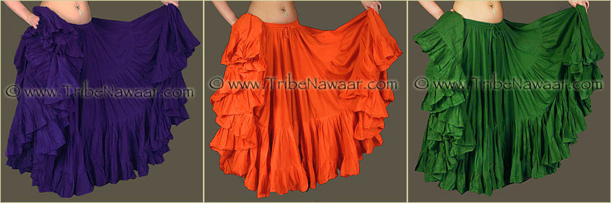
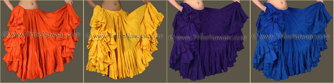
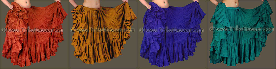
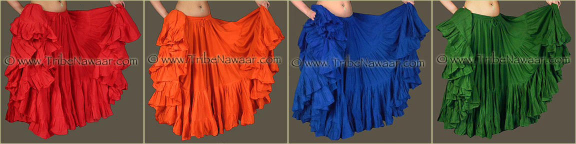
Tints, tones and shades are all words used to describe a color’s value. A color that is tinted has had white added to it and is a softer more, pastel version of the original color. A color that has had grey added to it is often referred to as a tone and has a more neutral color value. The deeper shades of color are made by adding black.
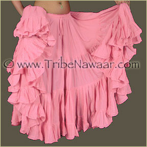
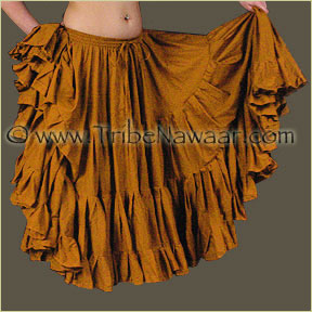
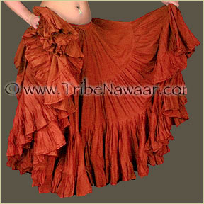
The color value can have a huge impact on a color’s symbolism. For example, darker shades of red symbolize power or energy, while the softer tints of red have an association with sweetness and gentle actions.
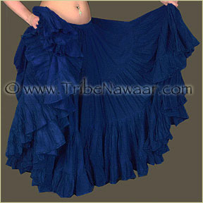

The same goes for blue. Deeper shades are associated with royalty and have a authoritative value, while the softer tints of blue convey a sense of serenity and calmness.
Quantity & Placement
How much of any certain color you use will also effect it's symbolic impact.
For instance, adding a few accents of white to a costume's color scheme is unlikely to have your typical audience member make an association with brides or the recently deceased.
However, using an all white costume may.

Additionally, how you place your main & accent colors can effect how the color is perceived. Take the following examples:


Therefore, when choosing your costuming colors for yourself or your dance company, you may want to take into consideration the background and surrounding colors. The same holds true for choosing the accent colors for an individual’s costume. Will the accent color you are considering appear darker or lighter when paired with the main costuming color? Will it appear larger or smaller?
Combining Colors
There are many ways to combine colors. Some combinations create a mood or stimulate the eye. Too much color chaos and the viewer becomes over stimulated and looses focus. On the opposite spectrum, if the colors are too monochromatic and not varied enough, the viewer becomes bored and uninterested.

As you can see, choosing a good balance and harmony of colors becomes extremely important for professional stage work. You want your audience to be drawn in to your presentation by a balance of color combinations in your costuming, backdrop and props. If you overwhelm them with a chaotic color palette it may make it difficult for them to focus on the dance and too little visual interest and their attention may wander.
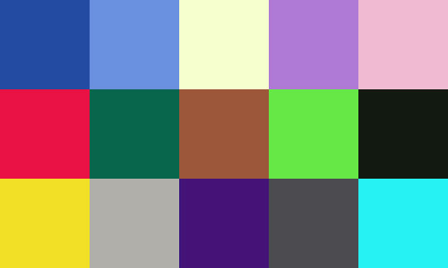
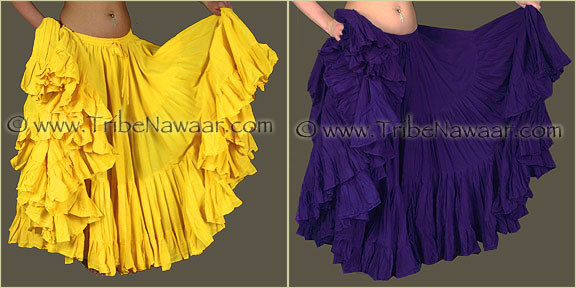
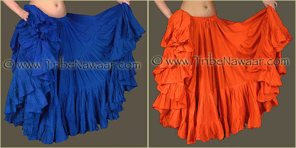
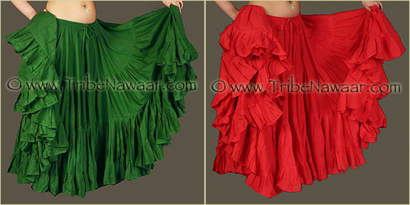
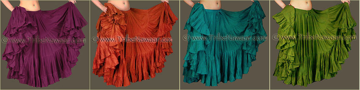
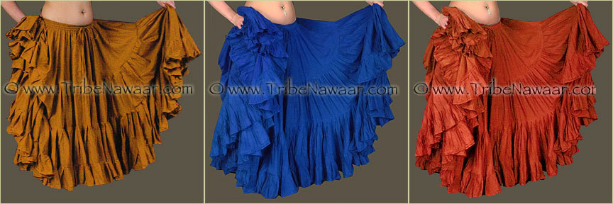
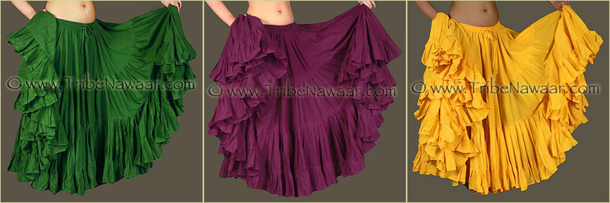
Color Harmonies 1: Complementary
All of the these examples of complementary color harmonies can be tinted, toned or shaded to create a variety of hues:
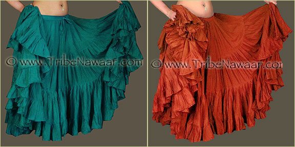

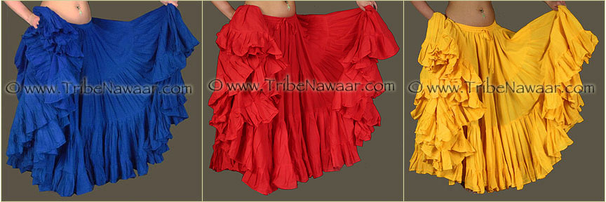
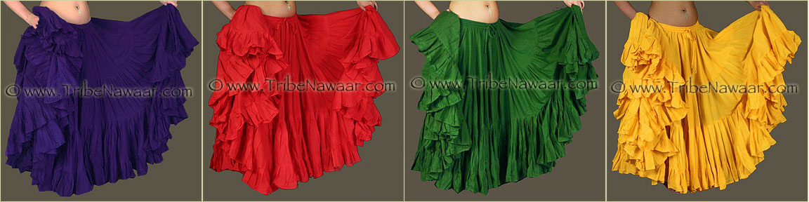
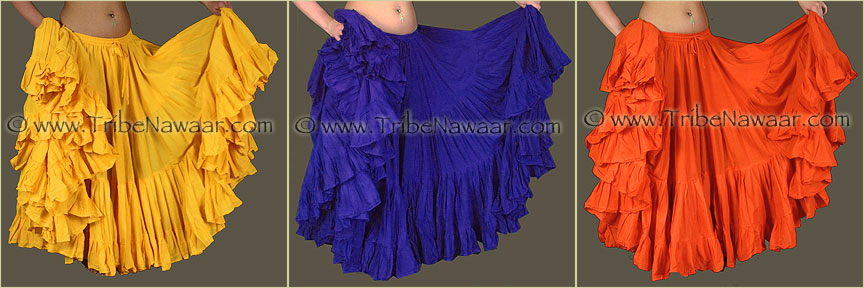
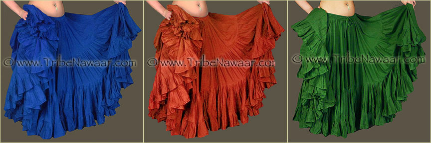
Color Harmonies 2: Triadic
These colors are all spaced equally apart on the color wheel and work well for troupe or individual costume schemes.
For an individual costume, choose one color as your main color theme then add the other 2 colors as accents. For troupe costuming, each dancer could choose one of the 3 triadic colors, then choose her (or his) accent color(s) based on one of the other color harmony charts.
All of the following examples of color harmonies can be tinted, toned or shaded to create a variety of hues:

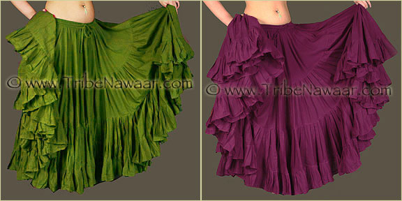
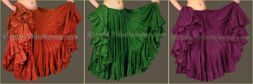
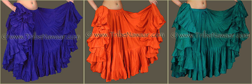
Color Harmonies 3: Tetrad
A tetradic scheme is based on 2 sets of complementary colors created by charting out the four points of a rectangle that is set within the color wheel.
For troupe costuming, each dancer could choose one of the 4 tetradic colors, then choose her (or his) accent color(s) based on one of the other color harmony charts.
All of the following examples of color harmonies can be tinted, toned or shaded to create a variety of hues:

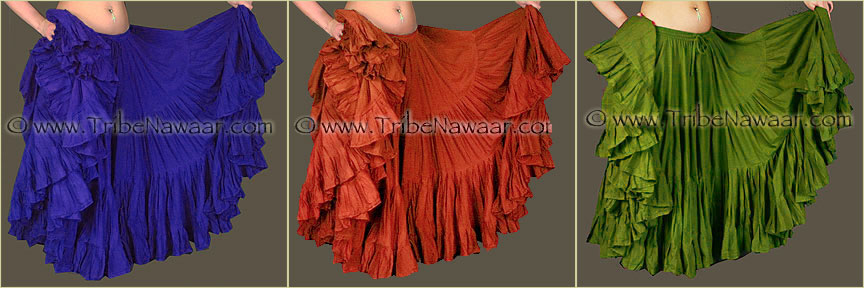
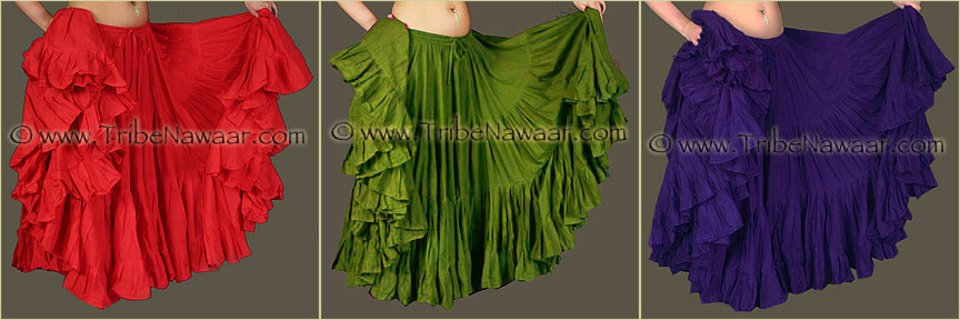
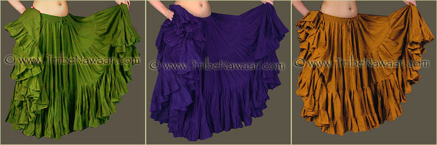
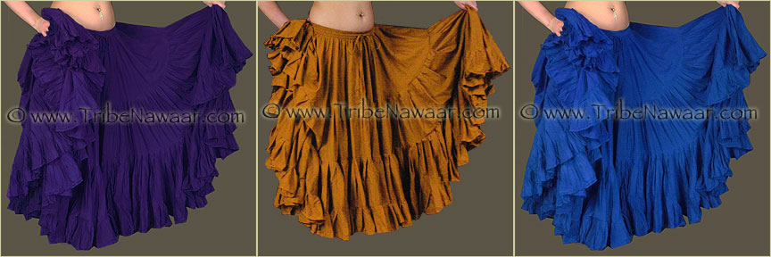
Color Harmonies 4: Split Complementary
A split complementary scheme represents a color and the two colors next to its complement on the color wheel.
For an individual costume, choose one color as your main color theme then add the other 2 colors as accents. For troupe costuming, each dancer could choose one of the 3 split complementary colors, then choose her (or his) accent color(s) based on one of the other color harmony charts.
All of the following examples of color harmonies can be tinted, toned or shaded to create a variety of hues:


Closing Thoughts On Color Theory For Costuming..
Feel free to use this info as a guide or inspiration… or branch off from these theories and create your own unique look. Some of the greatest artists of our time have used basic color theory as a spring board for creating entirely new combinations. So, get out there, express yourself and dance!
If you feel like you could benefit from my personal suggestions on your next purchase thru our online marketplace or in the studio. Just email me your costuming dilemma. I am always happy to help a fellow dancer out with color suggestions and pairings and often can help with other weird and random costuming issues that come up.
~Jennifer
Text & images © 2002- 2017 Tribe Nawaar, Content written by Jennifer Secrist Goran of Tribe Nawaar. If found elsewhere, either in pieces or in entirety, it has been stolen from our site.